- Subscribe to RSS Feed
- Mark Topic as New
- Mark Topic as Read
- Float this Topic for Current User
- Bookmark
- Subscribe
- Mute
- Printer Friendly Page
Moving Kudos button on forum messages?
02-10-2011 09:38 AM
- Mark as New
- Bookmark
- Subscribe
- Mute
- Subscribe to RSS Feed
- Permalink
- Report to a Moderator
@Laura F. wrote:
Keep in mind that only people that start threads see the Accept as Solution button so it's not actually visible to many people.
True. Even if you can't line them up, it's a good change.
02-10-2011 11:50 AM
- Mark as New
- Bookmark
- Subscribe
- Mute
- Subscribe to RSS Feed
- Permalink
- Report to a Moderator
Sorry, I really do not like this "move". An additional button would not bother me, but when I am scrolling through a thread one of two things will catch my attention to read a post, Kudos count or Avatar. Right now they are nicely colocated. I suppose those who spend time on "that other board" will apppreciate the move...![]()
02-10-2011 12:12 PM
- Mark as New
- Bookmark
- Subscribe
- Mute
- Subscribe to RSS Feed
- Permalink
- Report to a Moderator
If for no other reason, I like it because I may get some extra kudos from people's poor hand-eye coordination while trying to press Reply ![]()
02-10-2011 12:53 PM
- Mark as New
- Bookmark
- Subscribe
- Mute
- Subscribe to RSS Feed
- Permalink
- Report to a Moderator
@cory K wrote:
If for no other reason, I like it because I may get some extra kudos from people's poor hand-eye coordination while trying to press Reply
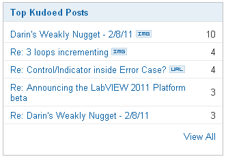
No, No, no, must be stopped. Right now you have single-handedly thwarted my domination of the Top Kudoed Posts (last 7 days).

Maybe I'll let it slide since you were replying to my thread, and wait, one of those 3 Kudos was from me....
Ben can have his Kudo Yahtzee, I have to set my sights much, much lower. Waited one week for the Beta announcement to slide off, and you sneak in there...![]()
02-10-2011 12:55 PM
- Mark as New
- Bookmark
- Subscribe
- Mute
- Subscribe to RSS Feed
- Permalink
- Report to a Moderator
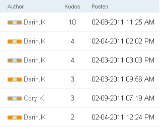
Hahah well if you look really quick, all you see is ____ K, and even the color bars are the same. So maybe no one will notice I snuck in there ![]()
02-15-2011 09:05 PM
- Mark as New
- Bookmark
- Subscribe
- Mute
- Subscribe to RSS Feed
- Permalink
- Report to a Moderator
For the record, not a fan of the new look. Probably in the minority....![]()
02-16-2011 12:11 AM
- Mark as New
- Bookmark
- Subscribe
- Mute
- Subscribe to RSS Feed
- Permalink
- Report to a Moderator
@Darin.K wrote:
For the record, not a fan of the new look. Probably in the minority....
I'll join you. Way too easy to accidentally click on the Kudos button (though clearly some would see this as a good thing). If placed in the message body I think it would be better to have right-justified between the Options menu and the Repy button. Even with one-line messages there's enough space there to limit accidental clicks.
Aside: what was wrong with where it was originally? Was there a technical issue?
02-16-2011 03:13 AM
- Mark as New
- Bookmark
- Subscribe
- Mute
- Subscribe to RSS Feed
- Permalink
- Report to a Moderator
Now that the new arrangement has been realized I'll join the minority: Having a long thread without a solution such as this one in the past it was useful to browse over the contributors and the kudoes to quickly spot the most interesting messages. Now this information is delocalized, the user information is on the left, while the message kudoes are on the right.
In summary, I did prefer the previous scheme - obviously getting old and conservative ![]()
02-16-2011 08:32 AM
- Mark as New
- Bookmark
- Subscribe
- Mute
- Subscribe to RSS Feed
- Permalink
- Report to a Moderator
@Darin.K wrote:
@cory K wrote:
If for no other reason, I like it because I may get some extra kudos from people's poor hand-eye coordination while trying to press Reply
No, No, no, must be stopped. Right now you have single-handedly thwarted my domination of the Top Kudoed Posts (last 7 days).

Maybe I'll let it slide since you were replying to my thread, and wait, one of those 3 Kudos was from me....
Ben can have his Kudo Yahtzee, I have to set my sights much, much lower. Waited one week for the Beta announcement to slide off, and you sneak in there...
That was a fluke I don't think I can duplicate with my busy schedule since disapearing for a week can really hit your numbers.
Christian on the other hand has been working up to a super Yatzee from time to time with the "last year" catagory being the only area he is mssing.
But if you keep it up, you have a good shot at the Kudo Yahtzee.
Ben
02-16-2011 08:48 AM
- Mark as New
- Bookmark
- Subscribe
- Mute
- Subscribe to RSS Feed
- Permalink
- Report to a Moderator
The idea behind the Kudos move is that when viewing a thread, Kudos should be associated with the content of the message itself rather than the user. Hopefully this change will make that clearer to new users and help them actually see the Kudos button. It can blend in with the user area on the left hand side of the thread.

