View Ideas...
Active
Inactive
Inactive
Turn on suggestions
Auto-suggest helps you quickly narrow down your search results by suggesting possible matches as you type.
Showing results for
Options
- Subscribe to RSS Feed
- Mark as New
- Mark as Read
- Bookmark
- Subscribe
- Printer Friendly Page
- Report to a Moderator
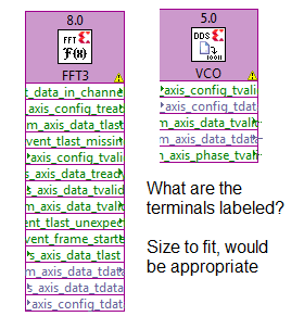
Size Xilinx IP icon to fit its terminal labels
Submitted by
 heel
on
10-27-2011
08:15 AM
5 Comments (5 New)
Status:
New
Typical Xilinx IP core icon like FFT and DDS looks like this - in expanded mode:
The connector labels are very hard to read. I guess everybody agrees on that this could be improved. And it is not that there is a "standard" narrow width to obey, for instance FIFO is wider than the Xilinx IP icons.
Thanks for considering this.
Labels:
5 Comments
You must be a registered user to add a comment. If you've already registered, sign in. Otherwise, register and sign in.

