LabVIEW Idea Exchange

cancel
Showing results for 
Search instead for 
Did you mean: 
Naveen2411

How many need Delete Option on Context Menu?

Status: New

For LabVIEW users,

How many of them need "Delete Option" on Right Click Context Menu?

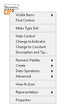
Delete option in Context Menu.png

I feel providing an delete option in right clicking context menu for any Indicator or Control deleting will make developers easy and fast assessable and avoid too-much use of keyboard.

We use our left hand for control and Shift more offen but for pressing delete button which is at right top corner in keyboard, all of a sudden we will remove our right hand from mouse and press Del which is uncomfortable.


So, Developers share your point of view for the same and request to add Delete Option in upcoming version.

Later we will ask even Cut Copy Past...:smileyhappy: He! He! He!

23 Comments
BodkinArrow
Member

May be they could place a 'Trash Can' icon somewhere on the front panel/block diagram so that if we drag and drop (what we need to delete) onto it. 🙂 Smiley Happy

JB
Trusted Enthusiast
Trusted Enthusiast

I have never missed "Delete" on the right click menu.


Intaris
Proven Zealot

I would be against adding anything like this which already has other methods of quick(er) access to the menus.

RavensFan
Knight of NI

If you added a Delete item to the context menu, then I think there is a pretty decent chance that there will be times that it is selected by accident.  I don't want to delete something accidentally.  So I would then want an "Are you sure?" dialog.  By the time you add that, you've negated any advantage of trying to have quicker access to delete by putting it on the context menu.

ToeCutter
Active Participant

Darin sums it up nicely. Kudos to this idea.

AristosQueue (NI)
NI Employee (retired)

> I don't want to delete something accidentally.  So I would then want an "Are you sure?" dialog. 


We don't have one on the Delete keyboard button, and that's much easier to hit by accident. We also just removed the "are you sure" dialog from the Remove Structure menu item in LV 2013 on customer feedback. There are plenty of destructive items in the shortcut menus. That's why we have undo.

Naveen2411
Member

Hi! Darin,


your feedback was a prefect of point view from a programmer and common man. Kudos to your points. 

Naveen2411
Member

To all new viewers,

Requesting to read the all comments and understand the "Right Cause" of the post and 

discuss on pro and cons for the same like Darin, AristosQueue sharing.... 

RavensFan
Knight of NI

@AristosQueue (NI) wrote:

> I don't want to delete something accidentally.  So I would then want an "Are you sure?" dialog. 


We don't have one on the Delete keyboard button, and that's much easier to hit by accident. We also just removed the "are you sure" dialog from the Remove Structure menu item in LV 2013 on customer feedback. There are plenty of destructive items in the shortcut menus. That's why we have undo.


When I wrote that, I knew I was going to sit around waiting for someone to mention Undo, which is a perfectly good way to fix a mistake.


And I really don't want an "Are you sure?" dialog on this.  I'm glad that was removed like you said.  But I still want to prevent accidental deletions.


I disagree that the Delete key is much easier to hit by accident.  My finger to key dexterity skills are much better than my mouse hand not accidentally sliding up or down from one menu choice to another while I'm trying to click a mouse button.  (I find that AutoCAD is particularly setup poorly on its context menu.  When I right click to pick a midpoint, or endpoint, or perpendicular, by the time I release the button, something else has gotten selected.  Not sure why I frequently have problems there, but only occasionally on other program's context menus.)


I just feel that Delete on the context menu is such a low priority that it is non-existent.  There are many things that deserve to be on the context menu.  I don't want things like delete on there because it just clutters up the menu for the things that deserve to be there.  When the context menu becomes too large, it becomes unmanageable as a whole.

Darin.K
Trusted Enthusiast

I don't want things like delete on there because it just clutters up the menu for the things that deserve to be there.


One more submenu really pushes the clutter over the edge?  What are you guys continually reaching for down there, View as Icon?


I noticed the lack of RCM functionality (moreso copy/paste than delete) when trying to use my graphics tablet, you know, LV being graphical and all.  Transitions to the keyboard are just disastrous, much worse than even awkward context menus.


If clutter is the issue, the solution is prioritizing and nesting menu items, not eliminating items.  Do one-time options like View as Icon, Description and Tip, and Representation really need top-level real estate?  I wouldn't think so.  Other programs pack a lot into the menus, and the well-designed ones give you complete functionality along with the convenience of putting the truly common functions in easy reach.  So much wasted motion in many of these menus.