-
Analysis & Computation
305 -
Development & API
2 -
Development Tools
1 -
Execution & Performance
1,023 -
Feed management
1 -
HW Connectivity
115 -
Installation & Upgrade
267 -
Networking Communications
183 -
Package creation
1 -
Package distribution
1 -
Third party integration & APIs
286 -
UI & Usability
5,435 -
VeriStand
1
- New 3,038
- Under Consideration 4
- In Development 4
- In Beta 0
- Declined 2,636
- Duplicate 710
- Completed 338
- Already Implemented 114
- Archived 0
- Subscribe to RSS Feed
- Mark as New
- Mark as Read
- Bookmark
- Subscribe
- Printer Friendly Page
- Report to a Moderator
View >> Gigantic Coercion Dots (now with a variety of colors)
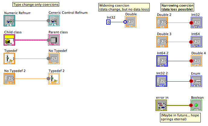
We have (collectively) complained about coercion dots many times on various LV forums -- they are nearly invisible and there are three different kinds, which require different levels of concern. The problem is that there are very few pixels within a terminal and there's no space for any pattern to differentiate the three kinds of coercion (and changing colors is a problem for reasons discussed here in the Idea Exchange).
Another LV developer had an idea that I liked: add an option to view giant coercion dots. We have avoided this because coercion dots bigger than the terminal would interfere with wiring. However, many developers have a policy of eliminating all coercion dots on their diagrams. For those who have such a policy, they could eliminate the coercion dots as they work, and thus might not see any problem from such large dots. Large dots would solve lots of other usability problems that coercion dots have today.
This option could be something in Tools>>Options, but I'd rather it be something in the View or Edit menus so it can be quickly toggled on or off with a shortcut key.
These graphics are "programmer art" -- I just made the three dots look different. Please sumit alternate images for the three dot types if you have better style suggestions. I did make the three dots differ in both pattern and color so that we avoid problems with colorblindness. The type-only was a solid dot, the widening coercion is a bulls eye, and the narrowing coercion is a single ring. Any redesign should definitely take colorblindess into account.
You must be a registered user to add a comment. If you've already registered, sign in. Otherwise, register and sign in.

