Hello guys,
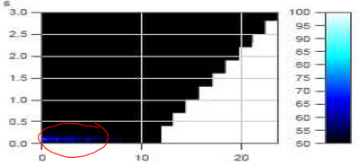
is it possible on DIAdem to create a Colormap on the Report section? I explain here what I have to correlate: I have 30 brake application with 10 different pressure levels (so each pressure level is repeated x3 applications). Each pressure level is reached with the same ramp (xx bar/sec). For each brake application I have also the records from a microphone (dB). The graph need to realize is like this one:

On vertical axis there are the IDs of the brake applications divided by 10 (I don't know why, but is ok). On horizontal axis there is the time. Starting from 0, as the pressure levels are increasing, you can see the "step-blocks" moving towards the right (same pressure ramp, so increasing time to reach the target for increasing pressure level). What I have to do is to realize a graph like this with the "external color palette". I tryied by using waterfall etc but I don't really know how to realize it!
For sure I have separate channels for each application (pressure level, amplitude (dB), time of the brake stop). Any suggest? Thanks!