- Subscribe to RSS Feed
- Mark Topic as New
- Mark Topic as Read
- Float this Topic for Current User
- Bookmark
- Subscribe
- Mute
- Printer Friendly Page
Multi colored Graduated Bar
 pallen
03-20-2008
01:04 PM
- last edited on
06-01-2025
05:07 PM
by
 Content Cleaner
- Mark as New
- Bookmark
- Subscribe
- Mute
- Subscribe to RSS Feed
- Permalink
- Report to a Moderator
I'm looking for a way to make a multi colored Graduated Bar. Basically like the original Slide I've got a picture of. But basically having three different fill colors. Green at the bottom. Yellow in the middle, and red at the top. 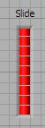
I found one post on the boards that could change the entire fill color depending on the level. But that's not quite what I'm looking for.
https://forums.ni.com/t5/LabVIEW/horizontal-progress-bar-with-interpolate-color/m-p/38625?query.id=2...
Is what I want to do possible?
Message Edited by pallen on 03-20-2008 02:05 PM
 tst
tst
03-20-2008 01:38 PM
- Mark as New
- Bookmark
- Subscribe
- Mute
- Subscribe to RSS Feed
- Permalink
- Report to a Moderator
___________________
Try to take over the world!
03-20-2008 02:32 PM
- Mark as New
- Bookmark
- Subscribe
- Mute
- Subscribe to RSS Feed
- Permalink
- Report to a Moderator
Thanks for the info. It took a little bit of messing around to get exactly what I wanted. But this looks like it'll work for me.
 RavensFan
11-19-2008 08:54 PM - edited 11-19-2008 08:57 PM
- Mark as New
- Bookmark
- Subscribe
- Mute
- Subscribe to RSS Feed
- Permalink
- Report to a Moderator
Thanks for the VI. This progress bar is going to come in handy for something I want to do.
I am reposting it with one modification. I found that if you were in green or yellow, the red bar would just appear at the very bottom and flicker a bit. When you moved into red, all looked good.
I reordered the 3 sliders so that green was #3, and red was #1. That way the unused sliders of yellow or red, would appear under the green one and show smooth transition no matter what the level was.
Quick question. Is there a way to control how tall the individual segments of the bar are? I see if you make the total slider taller, you can get more segments, shorter - less. But an individual segment is always about 10 pixels tall. I would like to get a relatively shorter slider with a height of about 60, but have it show up with 15 segments. So a segment might be 3 pixels high with a 1 pixel separator.
11-20-2008
03:04 PM
- last edited on
06-01-2025
05:07 PM
by
Content Cleaner
- Mark as New
- Bookmark
- Subscribe
- Mute
- Subscribe to RSS Feed
- Permalink
- Report to a Moderator
Hi Ravens Fan,
I do not think there is a property node to do this. Or at least I have not been able to find one and I looked for quite some time. I think to do this you will need to create a custom control. Take a look at this part of the LabVIEW Help for how to get started with this.
National Instruments
Applications Engineer
 Dhvanil479
07-25-2019 04:30 AM
- Mark as New
- Bookmark
- Subscribe
- Mute
- Subscribe to RSS Feed
- Permalink
- Report to a Moderator
i have gone through changing_progress_bar.vi but i found some problem in your vi. Here i have attached image which indicates my problem in progress bar. Please do needful.
Problem is when we start a vi then red color is by default present below the 0 limit and if we change the limit to above the certain limit for red color then red color is disappear in stating point.here problem is when i run the vi then by default red color is indicate below the 0
when limit is above the set limit then red color is gone.
07-28-2019 09:39 AM
- Mark as New
- Bookmark
- Subscribe
- Mute
- Subscribe to RSS Feed
- Permalink
- Report to a Moderator
I hadn't noticed that issue.
One way of addressing this is with a couple of property nodes.
 Bob_Schor
07-28-2019 10:44 AM
- Mark as New
- Bookmark
- Subscribe
- Mute
- Subscribe to RSS Feed
- Permalink
- Report to a Moderator
What timing! Two days ago, I wanted to make a Slide Control to test an Alarm system I'm developing that will send an alarm if a signal is "too low". I wanted a slider to generate a test signal, and wanted a visual indicator when I was in the "Danger Zone". Here's what I came up with:
Flow Control
Using Flow Control
The first is a picture of the Control on the Front Panel. It looks like a simple Slider Control, but it actually has two Sliders. Slider 1 is at 100, and shows the dark blue background to its left. Slider 2 is initialized at the "Danger" level of 40 (via a Property Node), and has its background set to Red. But where is it? It is at 40, of course. What I did was to grab the corners of Slider 2 and make it as small as possible (so that it couldn't easily be "grabbed" and moved). I also made it Transparent, so "He Cannot Be Seen" (blooey!). lso
I aIso added the Snippet where I show how I read Slider 1 and use it. When I went to post this code, I realized that I didn't handle the possibility that I clicked on the "invisible" Slider 2 and moved it by accident, so I added the code to reset the Slider "just in case".
Bob Schor
