LabVIEW Idea Exchange

cancel
Showing results for 
Search instead for 
Did you mean: 
JackDunaway

Connector Pane Overhaul

Status: Completed

Available in LabVIEW NXG 1.0. All connector pane terminals are the same size, and the pattern is specified as a grid of terminals (30x30, 40x40, 50x50, etc.).

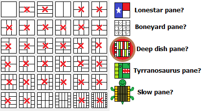
It has been mentioned before (here, and here, and here) that there are some problems with the connector pane. Let me add my suggestions. Does the image below ring a bell? WHAT GOOD ARE ALL THOSE CONNECTOR PANES FOR?


WhatPaneAreYou.png


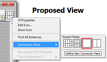
I suggest the following view:


ProposedConnectorPane.png


The "Define New Connector Pane" will allow you to contrive custom panes to suit your fancy. It could have templates of the current connector pane collection. Below is a pane you could create with the new editor (I would suggest combining the Icon Editor with the Connector Pane Editor!!!!). The only constraints that need to be imposed on a connector is that it is rectangular and touches the edge of the icon. Otherwise, you can make it however big you want it (for all the myopics out there like me!), and wherever you want it.


DefineNewConnectorPane.png


Two new concepts are introduced above: empty space, and the ability to land a wire NOT directly in the center of the connector. Placing the landing as close to the center as possible would alleviate the current problem of the "gapped wire" that does not touch slim icons (look at gap on top input and the output).

ConnectorPaneProblem.png

22 Comments
rgvdh@rdf
Member

Addendum (my attempt to edit timed out).

Once you've modified 5-2-2-2-5 so the corners line up with 4-2-2-4, there's no longer a need to add 4-TDC-4, which is how we get down to 6 options.


Maybe 8-2-2-2-2-2-2-8 should go away too, as it's very difficult to wire to.


X.
Trusted Enthusiast
Trusted Enthusiast

There would be a lot to borrow from the LabVIEW WebUI Builder concept of "expandable" connector panes too, IMO.

ouadji
Trusted Enthusiast

"Define New Connector Pane" ... kudos !

Yamaeda
Proven Zealot

Also, all single connecor panes can be scrapped. Having only 3 inputs is the same as 3 in and 3 unconnected out ... The 1-1 in/out is the same as a 3/3 with only the middle used, and so on.


Yes, it definatly needs some cleaning.


/Y

G# - Award winning reference based OOP for LV, for free! - Qestit VIPM GitHub

Qestit Systems
Certified-LabVIEW-Developer
RavensFan
Knight of NI

@Yamaeda wrote:

Also, all single connecor panes can be scrapped. Having only 3 inputs is the same as 3 in and 3 unconnected out ... The 1-1 in/out is the same as a 3/3 with only the middle used, and so on.


Yes, it definitely needs some cleaning.


While some connectors may seem redundant, that isn't necessarily true.  You have to remember some special use cases with icons.
1.  Reduced size icon, rest of icon is transparent.  You want to have the X points of the terminal in a spot that makes sense relative to your icon.  That might happen to be the top row of a 3/3 icon.
2.  Where the X point is of an icon can vary depending on the number of terminals on the icon.  So on a 1 terminal icon.  It is dead center of the square.  On a very busy connector pattern, the X's would be much closer to edges.  Where this X is may matter to you since the actual terminal of a wire is at the X, not the edge of an icon.  So how much "hidden wire" there is may matter, or where the wire appears to go to in the event the wire winds up coming in from a direction that is not normal such as the top of a corner terminal rather than the side.
While I probably won't use any crazy connector patterns, it is nice to know they are available in the situation that one makes a bit more sense than another if I happened to be making an unusual icon design.
 
Yamaeda
Proven Zealot

@RavensFan, i think we're thinking of the same things, and should agree. I just did a test on a 3+0+0+3 pattern. Making the icon a square box about 6 pixels wide (full height) showed what i hoped, the connector moved to the graphical edge, and the middle connector was dead center. As such, 1+0+0+0, 1+0+0+1, 3+0+0+1 and 3+0+0+3 are the same from the middle connectors point, making the others excessive and the last one the only needed of those.

Changing to a 1+0+0+1 pattern and lessen the icon to ~50% height also showed that the connector wont center on the graphical middle, thus you'd still need a 3+0+0+3 (or 5?) to move the connector up.


Anyhow, there's definatly some patterns that can be optimized away. 🙂


/Y

G# - Award winning reference based OOP for LV, for free! - Qestit VIPM GitHub

Qestit Systems
Certified-LabVIEW-Developer
Yamaeda
Proven Zealot

BTW, G# sets the default pattern to 6+4+4+6, since it expects ref's at top and error at bottom, leaving 4+4+4+4 to user implementation. 

/Y

G# - Award winning reference based OOP for LV, for free! - Qestit VIPM GitHub

Qestit Systems
Certified-LabVIEW-Developer
RavensFan
Knight of NI

Your test of "similar" connectors might seem like the are the same for your particular case.  But suppose you want 2 in's and 2 out's on 2/3 height icon, then 3+0+0+3 is a better choice than a 1+0+0+1 or a 5+0+0+5.  Or if you want a 2 in 2 out on a 1/2 height icon, then a 4+0+0+4 would be best.

Yamaeda
Proven Zealot

Absolutely! What i'm advocating for is the removal of single sided patterns (like the 1+0+0+0) and even all 1 or 2 connectors as the 3's and 4's fill the same role. Even the patterns without top-bottom-connectors can go, as if you dont connect them the icon will behave as one without (i just tested).


Basically you could do with the following:

3+2+2+3

4+2+2+4

5+3+3+5

6+4+4+6

8+6+6+8


Ofcourse the connector-behaviour when changing pattern could use some polish at the same time. 🙂


/Y

G# - Award winning reference based OOP for LV, for free! - Qestit VIPM GitHub

Qestit Systems
Certified-LabVIEW-Developer
RnDMonkey
Active Participant
My favorite conpane for slim functions is the 3-2-2-3, rotated 90 degrees. It gives two terminals on each side that line up with the 4-2-2-4 panels, and a top-dead-center terminal for selectors and such. I can easily edit the icon for a perfectly half-height icon.
____
Ryan R.
R&D